Creating a More Authentic Social Media Platform
When our team embarked on this journey for our design capstone project, we started with a vast mind map of problems we were passionate about working on. The scope of the capstone afforded us two quarters are approximately 20 weeks to need-find, design, and build a product from zero to one. This design sprint started in multiple directions with us exploring a variety of problems worth dedicating our senior year to solving. We started big by mind mapping dozens of interesting problems we were curious enough to build a solution to. From there, we landed on one general hero. How can us, 5 college seniors, meaningfully stay connected after graduation? This guiding question led us to Tidbit.
Existing tools built to stay connected make it difficult to share authentic, low-pressure moments of daily life
While people want to stay connected, today's options fall short:
- Journaling is personal but inconsistent. Users struggle to maintain entries without an external reason to keep going. Additionally, journal entries are often too personal to share, especially in today's world where public social media posts are more glorified and curated than ever.
- Social media feels performative. lLarge audiences and platform norms make even "close friends" posts feel curated and inauthentic. Users' feeds are cluttered with "nonsense"
- Tracking apps like Beli or Strava capture specific hobbies but not the breadth of daily life.
Because people feel a growing disconnect between how they live and how they document their lives, communities people care about and genuinely want to keep up with can fade into the background.
A mobile app that turns personal reflection into a shared, creative ritual.
Tidbit encourages users to document "the little moments" in a freeform canvas. This collage style makes recording memories fun and lighthearted, capturing the authenticity of personal documentation and the joy of sharing. The multimedia canvas also allows users to include text, photos, and drawings to reflect the full experience. These "pages" can be shared to collaborative books that are shared with friends, family, or personal books for keeping track of specific things. Users can then open their books and flip through update pages from their close friends and family. They can now stay in touch in a more meaningful way, keeping up with small moments such as meals they ate or interactions they had, as opposed to a curated photo carousel with minimal detail.
People feel disconnected, and social media is not helping
We spoke with 16 participants across ages 20 to 24. Our interviewees ranged from new grads to lifelong journalers so we could better understand how people stay in touch and document their lives. The conversations revealed a tension between wanting to feel close and not knowing how to reach out. While social media offered visibility, it often lacked sincerity. Journaling felt grounding, but isolating. Everyone wanted a middle ground of something slower, smaller, and more personal.
Key Themes from Conversations:
"It's easy to drift apart."
Even with the best intentions, distance turns closeness into occasional check-ins. People want to stay connected but don't always have a natural reason to reach out.
"Social media feels performative."
Posting to an audience doesn't feel authentic. Most participants said they curate or hold back online to avoid seeming "too much" or "too personal."
"Journaling is for me, not for others."
Many participants journal privately but wish they could selectively share reflections. They want just enough to feel seen, without oversharing.
"My feed is filled with nonsense."
We repeatedly heard how frustrated people are with current social media content. It continually gets further from what they want to see, which is updates from their friends.
People need a low-pressure space where they can document small moments for themselves while naturally maintaining connections through shared reflection.
Competitive analysis
Existing social media platforms make sharing small, meaningful moments feel performative, while journaling apps turn reflection into a chore. There's no effortless, authentic space to capture everyday life as it happens.
IDEATIONNARROWING OUR IDEA
We knew that we wanted to combine the authenticity of personal documentation with the connectivity of a social platform, but what did this looks like? We created a massive mind map where we asked all the key questions, and ultimately landed on a concept ready for testing.
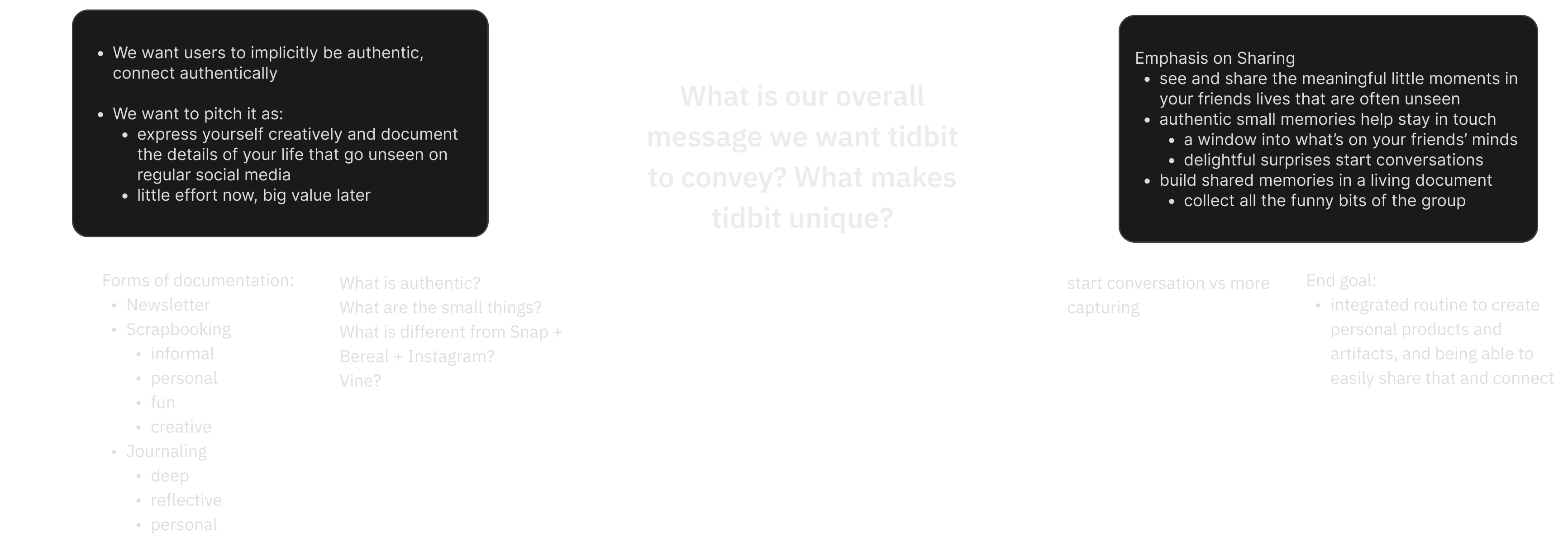

KEY ASSUMPTIONS TO TEST:
- Is it about staying in touch or just about documenting?
- How to create incentive + motivation to document?
- Is group incentive enough?
- What makes people think that others want to see what they are documenting?
- Documenting for yourself or for others?
- Should create emotional journey map
- Ask them how they'd feel about different variations of our product/essentially different directions we could go in
SO we made an experience prototype...
We tested our theory that people want to document small moments in their days in a freeform, collage style, then share them with close friends. We created powerpoint presentations and sent them to our group chats with friends. We gave them a simple direction: "At the end of the day, fill out a slide with photos, text, or any other media that encapsulates what you've been up to." We included one example slide with our own collages, then left them to update the presentation however they'd like.
The results? Overwhelming love.
USER TESTING RESULTS
Wireframes
Planning the user flow for opening a book and scrolling through pages.

ITERATION 1
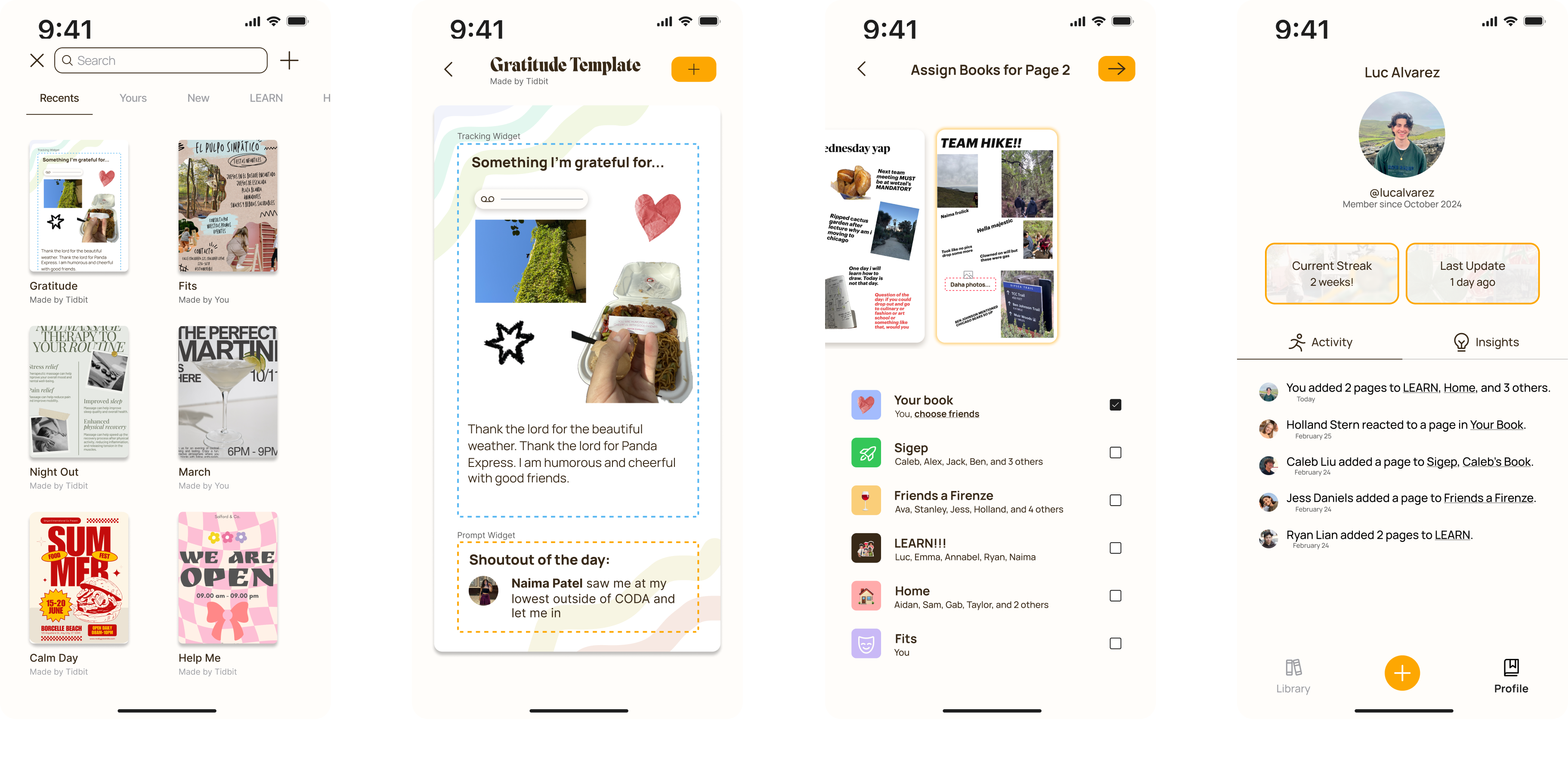
Our first approach started by opening the app to the library. Clicking on a book then took you to a screen where the page takes up the whole screen. Creating a page took the user to a screen where they could select which pages they wanted to add to what book. We also experimented with an activity page on the profile so users could stay up to date with all book additions.
Iteration 2: higher fidelity
This iteration represents both a higher fidelity and slightly reworked design from our initial exploration. This version has expanded functionality that now includes:
- Creation of group books
- Commenting and reacting to a page
- A demo of how the canvas will work
Through this process we learned ourselves about what direction we want to go with our visual design and what further functionality we feel was needed. We then tested this prototype with users...
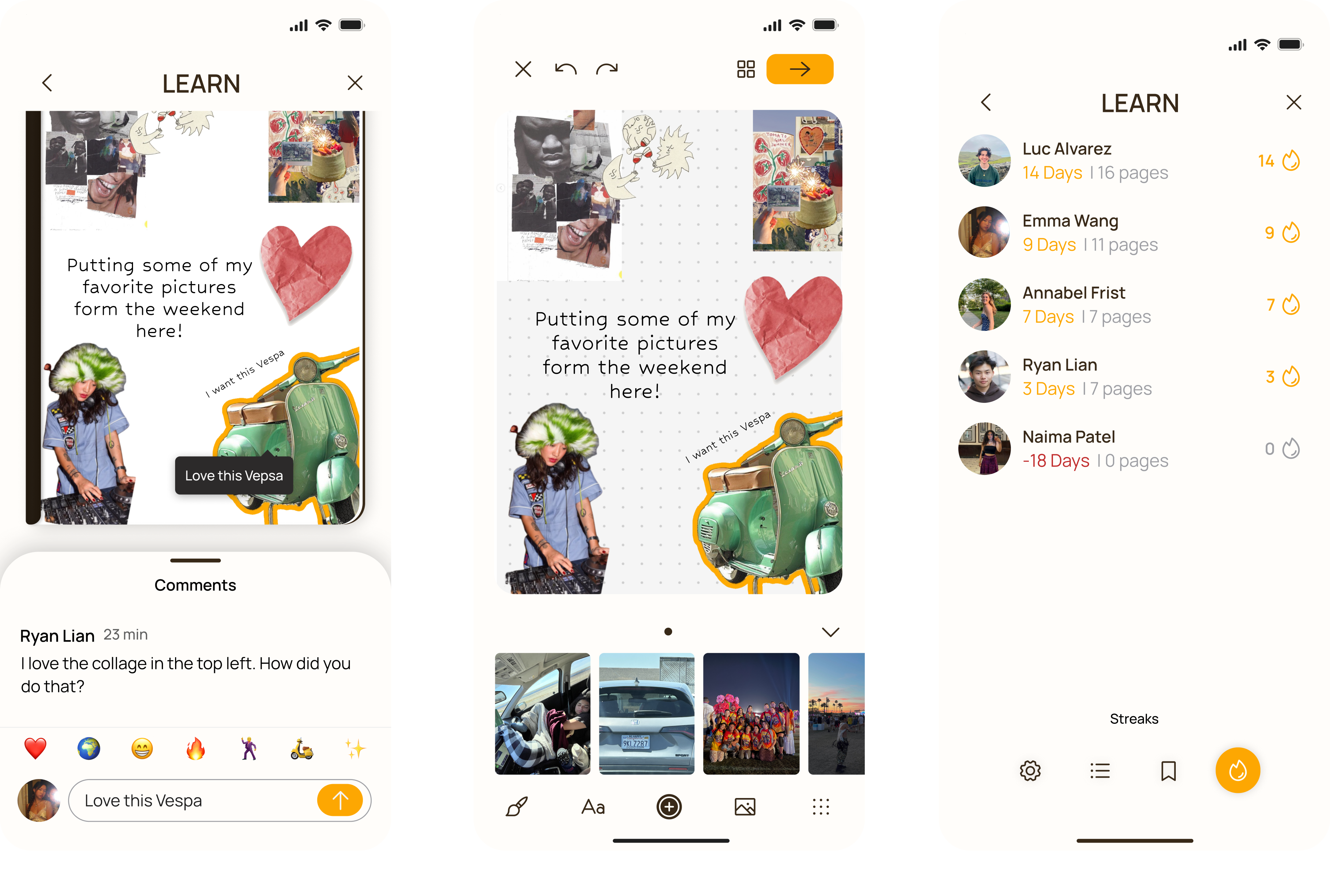
Comments are added to the page
Opening app to canvas with photo carousel
Group streaks
ITERATION 3: 5 key improvements
Our goals for this iteration based on user feedback:
- Make it as easy as possible to document → Open the app to the canvas first
- Make it easier to update a page throughout the day → Opening the app to the page you're editing
- Jot something down without the pressure of having to finish and share it immediately
- Taking inspiration from the notes app - just jotting things down and finishing it later
- Don't want it to feel like they starting with a blank canvas which can be intimidating →Including a carousel that allows users to immediately drag photos into the canvas
- Reactions: want to lean into the idea of contributing to the book → All the comments pop up on the page itself
- Incentivizing users to keep documenting on the app → Group streaks and personal streaks
MEET TIDBIT.
We fully built and launched the platform. Here are some key flows from the app itself.
Open Tidbit to the canvas where you can drag and drop photos, text, and widgets to document a moment. From there, you can select which collaborative books you want to share the page to. Is it to share a moment that you experienced with close friends? Is it to update your parents? Is it to keep track of a certain feature personally? Once the page is shared to a book, it will automatically save to your personal book.
Once you are in the library, select a book and scroll through friends' updates. You can see how many new pages members of books have added so you know you're up to speed. Then react, like, comment, and share to stay connected.
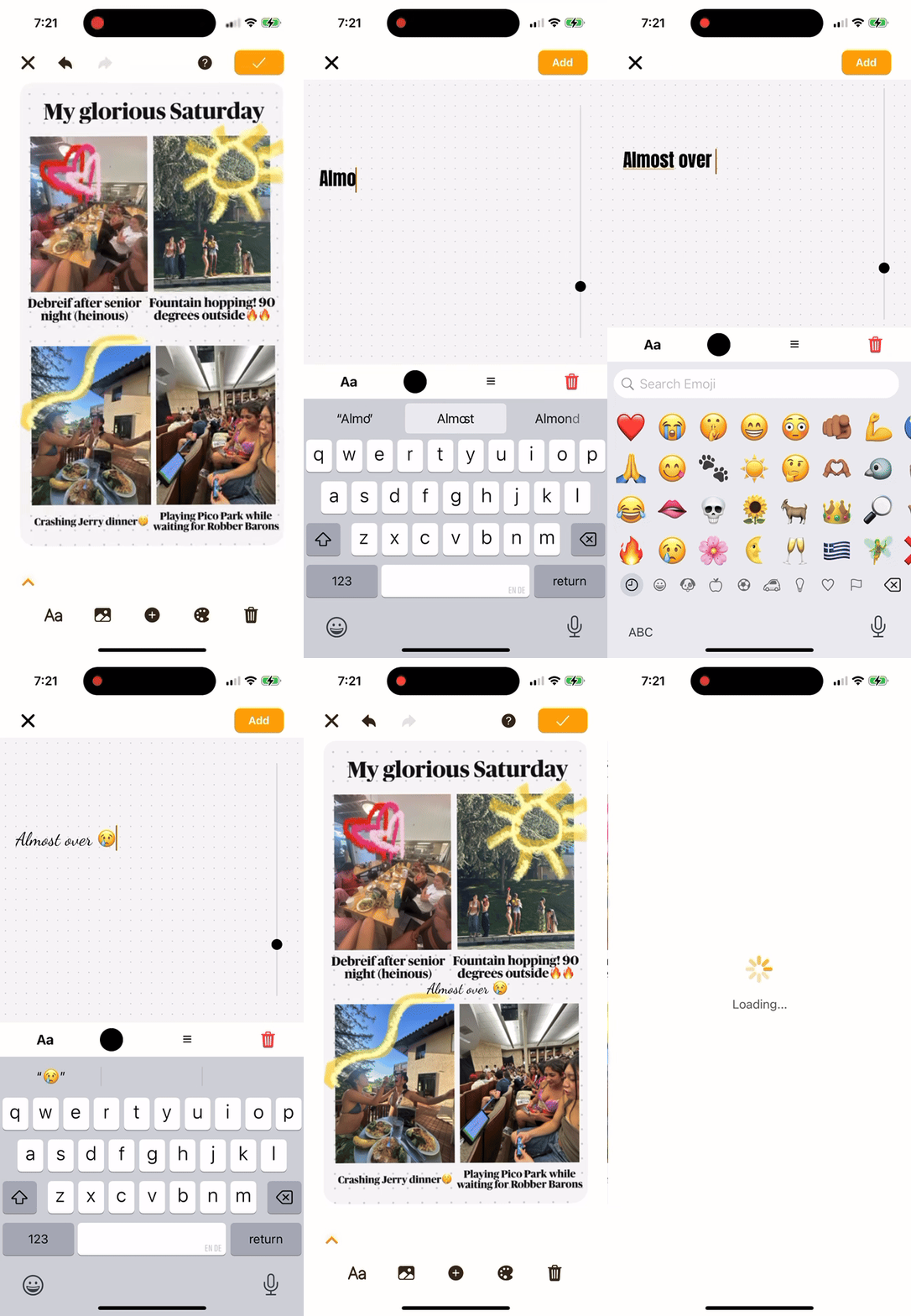
Documenting in the canvas
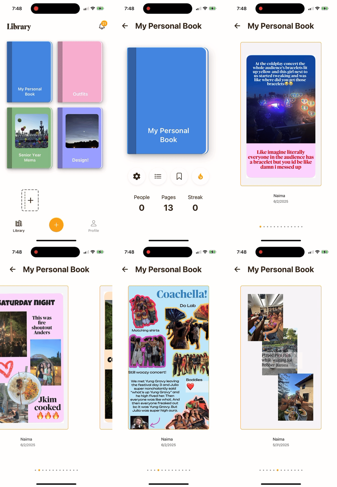
Personal books for documentation
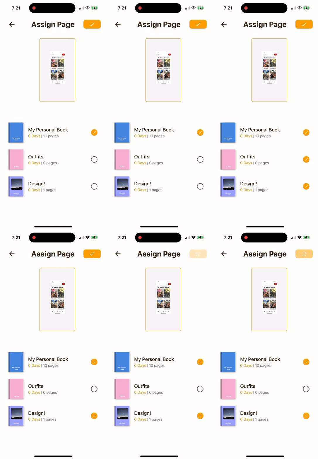
Book selection by page
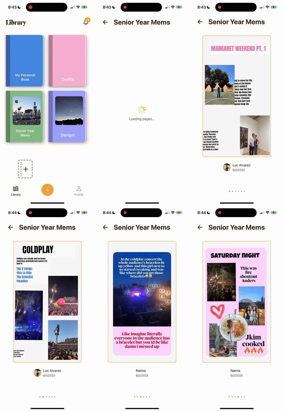
Scroll through friends' pages
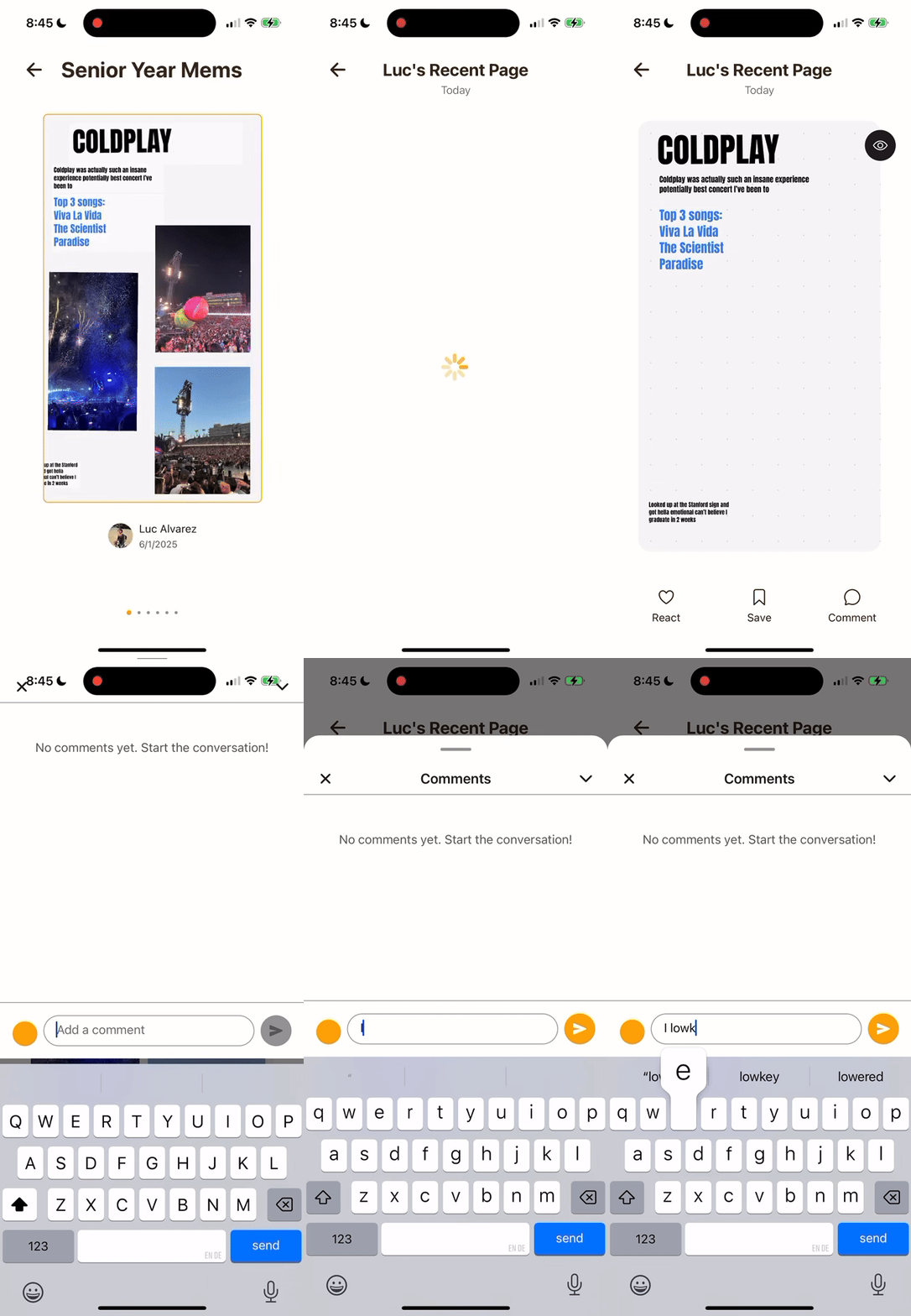
Comment and react on shared pages
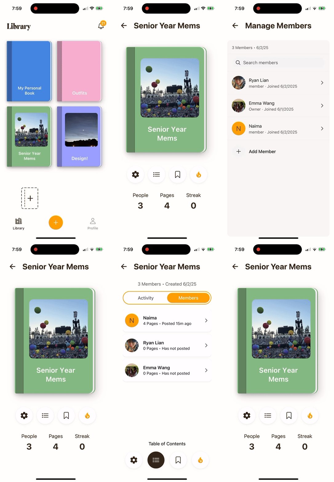
Settings and features of group books
FULL WALKTHROUGH
PITCHING TIDBIT
We presented our 20 weeks of work with a pitch to the Stanford d.school, alumni, collaborators, investors, and other students. We also managed a booth where people could explore our product and download the app to try it for themselves.
Tidbit is a continual project that we're working on. I learned so much from this process, including:
- How to move quickly without losing intention.
- Building, testing, and learning in tight cycles that made each iteration feel grounded in real behavior rather than assumption.
- How to find real meaning from interviews.
- Catching emotional cues and unspoken patterns that often pointed more clearly to user needs than direct answers did.
- How to design for emotion without over-designing.
- The most meaningful experiences came from removing friction and letting users express themselves naturally.
LESSONS LEARNED
Just start testing it
We spent a lot of time deciding how we could meaningfully synthesize all our interviews into a winning product. In the end, we only made progress once we made an MVP and started testing it with people.
Minimize friction to completing most important task
Getting users to document is the main functionality of our product. As a result, we made it a 3-click experience, and opened the app to the canvas. Next time, I won't rely on user feedback to make this design decision.
If I wouldn't use it, no one would
In the end, our team wanted to create this platform so we could document our thrilling senior year, and hopefully stay in touch after graduating. While it was a long journey, we ended with a product that we found ourselves saying we couldn't wait to keep using.

